

Showing posts with label drawings. Show all posts
Showing posts with label drawings. Show all posts
Thursday, April 19, 2012


Friday, March 25, 2011
Olympic Boulevard, Los Angeles

Juxtaposition of celebration and sadness on Olympic Boulevard in downtown Los Angeles. This is one of two new pieces for the Roots and Wings Project "Ignite" show at SPARC gallery in Venice on April 2nd (flier below).

Sunday, March 6, 2011
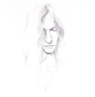
Portraits
I've been in good ol' portrait mode lately... here are a couple of new ones I did for fun.


Monday, January 24, 2011

Monday, January 10, 2011

Friday, November 12, 2010
Somewhere Better Than This Place, 1
I recently began working on a new series for an upcoming show this month in San Diego. This is the first in the series- in particular, a collage of memories surrounding my hometown (Calexico) and home county (Imperial). Some things hold more personal significance than others, though I didn't want to exclude anything that had a potentially beautiful aesthetic quality. Also included: a portrait of my parents on Christmas Eve, circa mid-1970s.


Wednesday, October 13, 2010

Thursday, September 30, 2010
Sharon Jones & the Dap-Kings
It's been a while since I focused on any sort of portrait, so I figured Sharon Jones & the Dap-Kings would make for a nice little warmup. Without going into it too much, I was trying to maintain a retro feel by keeping it mostly "black and white" while giving it a slight modern element with a little bit of color. So... did you spot all 8 Dap-Kings? (;


Monday, June 7, 2010
Greetings From Silver Lake
A new piece based on some of the more iconic signs seen on Sunset Blvd in Silver Lake. I wanted to create a portrait of the neighborhood, and excluded much of the extreme corporate signage in the area in order to avoid a potential watering down of what gives Silver Lake its unique, quirky charm. I'm still loving the brown kraft paper, though it sure does eat away at those Aquarelle colored pencils...

(On a side note, this piece also made for a nice postcard— I'll have a few for sale Sunday at the Atwater Village Festival.)

(On a side note, this piece also made for a nice postcard— I'll have a few for sale Sunday at the Atwater Village Festival.)
Wednesday, May 19, 2010
99 Red Balloons / Atwater Village Street Festival
My Ecotone (How the Coyote Came to Los Angeles) piece is now up for sale at the Canteen Gallery website alongside some awesome work... a nice opportunity to buy great work at a great price! All pieces are either $66 or $99.
I am currently working on some new items that will be up for sale at the Atwater Village Street Festival on June 13th to celebrate Atwater's Centennial. Most of the items will also be available at my Etsy store, along with the restocking of the ol' Internet and Greyhound comics.
I am currently working on some new items that will be up for sale at the Atwater Village Street Festival on June 13th to celebrate Atwater's Centennial. Most of the items will also be available at my Etsy store, along with the restocking of the ol' Internet and Greyhound comics.
Wednesday, May 5, 2010
Parallel Universes Come Together
This is a piece inspired by the Parallel Universe I and II pieces created for the ¡¿Que Barrio?! show last month, and a result of the two coming together. I was hoping the image would portray the idea of these corporations attempting to overshadow each other (especially in Mexico) and having the potential for never-ending growth, as symbolized by the negative space.


Monday, April 19, 2010
Parallel Universe
Aside from working on the design for the ¡¿Que Barrio?! flier earlier this month, I've also been working on a couple of pieces for the show itself. I've been bouncing around between issues when it comes to my work lately, and I thought it'd be interesting to find a link between consumption in Mexico and the U.S.
OXXO is the Mexican equivalent of the U.S. based 7-Eleven corporation, and I thought it'd be interesting to portray each outside the boundary of their usual country by placing the OXXO piece on display in the United States and the 7-Eleven piece on display in Mexico. (I'm aware that 7-Eleven has some presence in Mexico though it is less common than that of OXXO convenience stores, not to mention that it is based in the United States to begin with.) I also wanted to give the piece that convenience store feel by working on brown kraft paper, otherwise known as the paper used to create paper bags. I should be in town for the opening in El Centro so if you're in the area come stop by!


OXXO is the Mexican equivalent of the U.S. based 7-Eleven corporation, and I thought it'd be interesting to portray each outside the boundary of their usual country by placing the OXXO piece on display in the United States and the 7-Eleven piece on display in Mexico. (I'm aware that 7-Eleven has some presence in Mexico though it is less common than that of OXXO convenience stores, not to mention that it is based in the United States to begin with.) I also wanted to give the piece that convenience store feel by working on brown kraft paper, otherwise known as the paper used to create paper bags. I should be in town for the opening in El Centro so if you're in the area come stop by!


Thursday, April 15, 2010
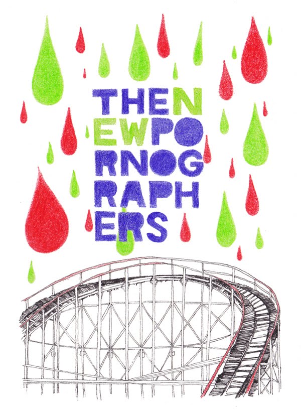
Coney Island rebirth
My Coney Island 3 piece (though modified a bit as seen below) has been selected for use for an upcoming New Pornographers shirt this year! Having been a fan of the band for many years now, I'm pretty excited that they chose my design. I can't wait to see the final shirt.

Friday, April 2, 2010
Ecotone (How the Coyote Came To Los Angeles)
I was recently invited to a group show at Canteen Art Shop + Gallery in Ottawa, Ontario, Canada. The theme of the show is "99 Red Balloons" (all pieces are 9" x 9" and $99 or $66 in price) and this piece is an imagined interpretation of how the coyote arrived in Los Angeles. I've seen quite a few coyotes roaming around the neighborhood in the past couple of years, and though it was initially very strange, I now consider them a normal part of our urban landscape.

Graphite and Stabilo Aquarelle watercolor pencil on Rives BFK printmaking paper.

Graphite and Stabilo Aquarelle watercolor pencil on Rives BFK printmaking paper.
Tuesday, March 2, 2010

Friday, February 19, 2010
Coney Island 3
I often find myself working in sets of threes, and this is no exception. I've created 2 other Coney Island pieces this year, and yet there is still something that pulls me back to the photos I took of the famous Cyclone roller coaster when I was there. I thought I'd finish off the set with one more piece, which will be up at the Land of Odd Gallery's 5" x 7" show this March.
I wanted to incorporate text (as I had with the 2nd piece in the series), and the idea of "Over and Over" came from both the idea of returning to the Cyclone as inspiration for several pieces, as well as the physical act of the roller coaster itself, remaining on the same track and repeating the same course day in and day out.

I wanted to incorporate text (as I had with the 2nd piece in the series), and the idea of "Over and Over" came from both the idea of returning to the Cyclone as inspiration for several pieces, as well as the physical act of the roller coaster itself, remaining on the same track and repeating the same course day in and day out.

Thursday, February 18, 2010
Prizefighter
This was a fun, simple commission that I completed late last week... very few requirements (b&w, 1920s–50s gentleman) and lots of freedom. I thought a portrait of a boxer with a black eye would be a nice break from my usual work. I think the ink wash complemented the idea pretty well.


Tuesday, February 9, 2010
AIGA Nebraska Love/Hate contest

(Photo property of AIGA Nebraska)
I had sort of forgotten about the AIGA Love/Hate contest that I entered a few weeks ago... winners were chosen and cards were printed/sold (actually still being sold online)... and I was lucky enough to be chosen as one of 18 winners! Aside from being professionally printed, all of the designs were also exhibited at the Bancroft Gallery in Omaha.
There are some pictures from the opening night of the exhibition at the AIGA Nebraska Flickr gallery, and the entire set of winning cards can be seen here.
Wish I could have been there... looks like it was a really nice show!
Wednesday, January 20, 2010
Animal Collective

I rarely do full on digital coloring, but I figured if there were ever a time, this was it.
Tuesday, January 12, 2010


Subscribe to:
Posts (Atom)
